Eye Candy

 Posted by
Jul 012013
 

stooges

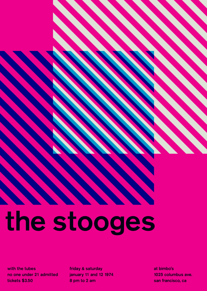
The work of graphic designer Mike Joyce is a marriage made in heaven: Typography and Punk. Joyce has transformed the d.i.y. flyers announcing punk and indie shows–the collaged, the Xeroxed, the disposable–and treated them to Swiss modernist style (anyone seen the documentary Helvetica?).

These posters, re-contextualized, visually engaging, and slightly humorous, are an homage to great gigs (see how many you’ve attended), and the formalized text and images that arose out of Switzerland in the ’50s that focused on cleanliness, order, objectivity, and readability.

See the work here at http://www.swissted.com

They’re all also available as an 11 x 14 book, with each page perforated so you can hang ’em on the wall.

What's your favorite style of concert poster?

View Results

Loading ... Loading ...
Share
Apr 042013
 

whatthefont

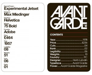
With all the recent threads about Mod’s hate/acceptance of ’80s music, we have neglected to fully discuss the style implications of Mod’s musical choices. (Haircut 100? With their short-on-the-sides-but-long-on-top hair, leg warmers, and prodigious use of artfully draped scarves, this is a band flaunting the styles which Mod has previously railed against.) However, I save that for another day…

What I can offer is this: a thread that I believe 99% of us can get behind. The link/post below provides an opportunity for us to

  1. Learn a little about the incredibly stressful work of a graphic artist
  2. Pat ourselves on the back about what would be our knowledgable and artistic visual choices
  3. Recall some music from the past (if anyone has actually listened to any of these bands or albums, please speak up)
  4. Snicker a little.

Let us all now come together and enjoy this:
http://fontfeed.com/archives/my-type-of-music_april-1st-2013/

Share

Lost Password?

 
twitter facebook youtube